Responsive Web Design
Are you finding your website not resizing with a proper format on different computing devices. With the use of latest mobile phones, smart hand held devices, compact size tablets, laptops, desktop responsive website is necessary.
Responsive Web design gives online growth offers brand productivity
Responsive web design is the essential way to promote the website on all mediums or devices. A website which comes with responsive format comes with HTML and CSS to automatically resize. Website Design Company put all the right Meta tagging to add responsive web pages. Resizing of the browser windows to put all the three elements as Left, main content and right to project with different sizes. Responsive Web design is all about displaying horizontally on large screens, vertically on small screens.
Responsive images add great impact with responsive web design
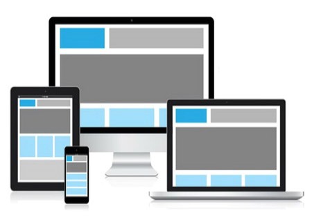
Responsive Web design adds images that fits nicely with any browser size. It adds with the right percentage value as the image scales up and down with resizing of the browser window. With the use of mobile devices all over the world to browse the internet is growing at a rapid pace. It is necessary to get your website module with responsive web design. For example the mobile phone users can see the content with single column view. The tablet user may show the same content with the two columns. There comes phone and tablets of different sizes and the same can be said about desktops and wearables. The responsive website displays the device on any devices, laptop, desktop, phones and tablets.
We use responsive web design in the following ways:
- The fluid grid concept calls for the page element size in relative units as percentages. It does not use absolute units as points or pixels.
- Relative units are also size in flexible images. It prevents them from displaying outside the contain elements.
- Media queries allow page to use different CSS Style based on characteristics of device display on browser windows.
- Responsive layouts gets adjusts automatically and adapts with any screen device size, whether it is any size screen device.
Image tagging, dimensions and with better layout for all devices
Responsive web design comes with creating page content that a viewer can easily use it any of the devices. Even the various image dimensions are use with checking major attributes as width and height. It is known as image tagging and comes with modern browsers to reserve space with image. The screen dimensions and width in CSS Pixels vary widely with devices between phones, tablets.
We have teams which are creative and work with best of the responsive web design companies. We helps you to increase your brand presence and leads to traffic growth. It further creates better revenue and profit and helps transform the brand potential that increase the online presence and visibility. Our rigorous process driven approach leads to easy distribution and publishing of content. It increase the brand value and also helps them transform ideas into profit ventures.
